








Fire department websites make the same accessibility mistakes over and over. Some are easy fixes. Some require a rebuild. All of them matter — especially now, with the DOJ's Title II compliance deadlines in effect for larger jurisdictions and arriving in 2027 for smaller ones.
Here are the ten most common mistakes, what the problem actually is, and what it takes to fix it.
1. Installing an Accessibility Overlay and Calling It Done
Accessibility widgets — those floating toolbar icons that promise to make your site "ADA compliant with one line of code" — do not work. The DOJ is explicit: overlays and widgets are not a substitute for actual WCAG compliance. They mask symptoms without fixing the underlying code. Numerous overlay vendors have faced legal action from disabled users whose assistive technology was actively broken by the overlay's interference.
Fix: Remove the overlay. Fix the underlying issues.
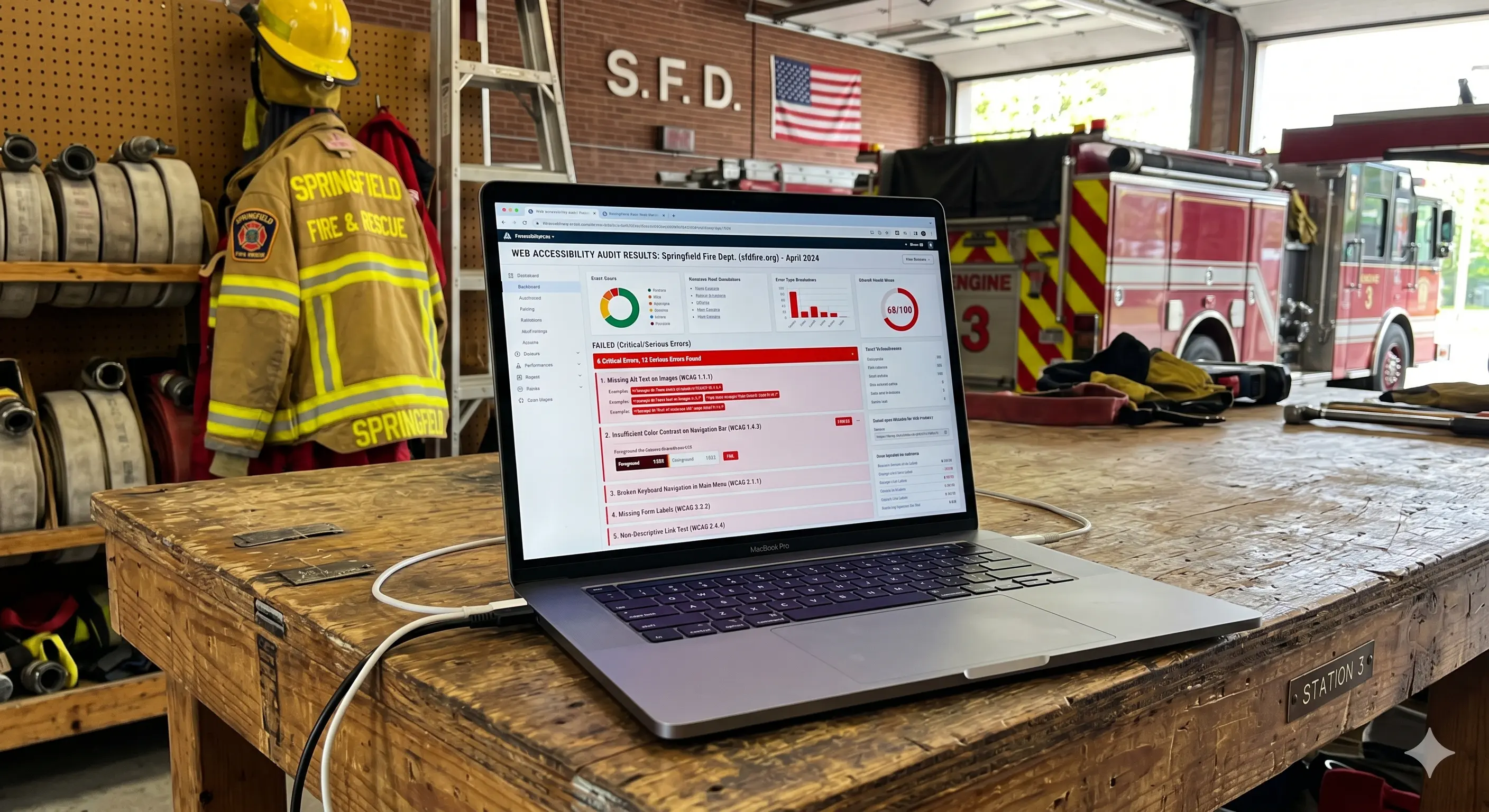
2. Missing or Inaccurate Alt Text on Images
Alt text is the text equivalent of an image, read aloud by screen readers for visually impaired users. Missing alt text means a screen reader announces "image" or the file name. Inaccurate alt text ("photo1.jpg" or "image of firefighters") provides no useful context.
Fix: Every meaningful image on your site needs descriptive alt text. Decorative images (backgrounds, dividers) should have empty alt attributes (alt="") so screen readers skip them. Audit every page.
3. Inaccessible PDFs
This is the most pervasive and least-discussed accessibility problem on government websites. Every PDF posted to your site — agendas, inspection forms, budget documents, SOGs, meeting minutes — must be accessible. A scanned document saved as an image PDF is completely invisible to a screen reader.
Fix: PDFs need to be tagged, have logical reading order, include alt text for any images, and be generated from accessible source documents (not scanned images). Run every PDF through Adobe Acrobat's accessibility checker at minimum.
4. Insufficient Color Contrast
Text must have a contrast ratio of at least 4.5:1 against its background for normal text, and 3:1 for large text (18pt+ or 14pt bold). Gray text on white, white text on light-colored buttons, and light text on photographic backgrounds are frequent offenders.
Fix: Use WebAIM's Contrast Checker at webaim.org/resources/contrastchecker to test your color combinations. Your brand colors may need adjusted shades for text use.
5. No Keyboard Navigation
Every function on your website must be operable with a keyboard alone — no mouse required. Users with motor disabilities rely on tab, enter, arrow keys, and other keyboard controls. If pressing Tab does not move focus visibly through your page, or if interactive elements cannot be activated without a mouse, your site fails WCAG 2.1 AA.
Fix: Test your site by unplugging your mouse and navigating with keyboard only. Every link, button, form field, and menu item should be reachable and activatable.
6. Videos Without Captions
Recruitment videos, apparatus tours, incident footage, and any other video content on your site requires accurate captions. Auto-generated captions from YouTube are not sufficient — they frequently misrender fire service terminology and proper names.
Fix: Add accurate, human-reviewed captions to all video content. For audio-only content (podcasts, recordings), provide a text transcript.
7. Form Fields Without Proper Labels
Contact forms, application forms, and feedback forms must have properly associated labels for each input field. Placeholder text inside the field does not count as a label — it disappears when the user begins typing and is not reliably read by screen readers.
Fix: Every form input needs a visible label element programmatically associated with it. Test using a screen reader (NVDA is free on Windows; VoiceOver is built into Mac).
8. Skip Navigation Links Are Missing
Keyboard users must tab through your entire navigation menu every time they load a new page to reach the main content. Skip navigation links — typically hidden off-screen but visible on focus — allow keyboard users to jump directly to the main content.
Fix: Add a "Skip to main content" link as the first focusable element on every page. It can be visually hidden until focused.
9. Mobile Accessibility Is an Afterthought
Title II covers mobile web, not just desktop. Touch targets must be at least 44x44 CSS pixels. Pinch-to-zoom must not be disabled. Content cannot require specific gestures that have no single-finger alternative.
Fix: Test your site on a mobile device with a screen reader enabled (VoiceOver on iOS, TalkBack on Android). Ensure tap targets are large enough and that zoom is not blocked in your viewport meta tag.
10. Set It and Forget It Mentality
Your site may have been compliant on launch day. It is almost certainly less compliant today. Every time your team posts an untagged image, uploads a scanned PDF, or adds a page without reviewing the heading structure, compliance drifts. Accessibility is not a one-time audit.
Fix: Establish an ongoing monitoring process. Train whoever manages your site on basic accessibility requirements. Consider a maintenance plan that includes regular ADA audits — exactly what Fire Watch includes in the Lieutenant and Captain tiers.
Where to Start
If this list feels overwhelming, start with the most common sources of complaints: missing alt text, inaccessible PDFs, and color contrast failures. These three categories represent the majority of documented ADA complaints against government websites.
If your site was built on a platform that makes these fixes difficult or impossible, a rebuild to modern accessibility standards will cost you less in the long run than an ongoing remediation fight with an inadequate CMS.